Coming from an engineering background my mind is often rigid framed and that affects my ability to compose my subjects when I am shooting. One singular rule that I have been adhering to all this time is: one subject and one background (good subject and good background of course). Nevertheless, great photographs rarely contain only one subject, in fact many interesting photographs are derived from the interaction of multiple characters within one frame, and their successful relationship with the chosen background that made the image work with impact. All this complicated stuff, too much for a simple minded photographer like myself to take in!
Sometimes, accidents happen, and accidents may not be all the time bad. For example, with this photograph below, as I was shooting the man selling lottery tickets, another man walked into the frame (on the right of the frame) which caught me by surprise. I did not intend to have him in the frame at all, because I was sticking to that one subject and one background rule. However, looking at two images (the accidental entrance of the man, and the one with only one man) I actually preferred the one composed by accident.
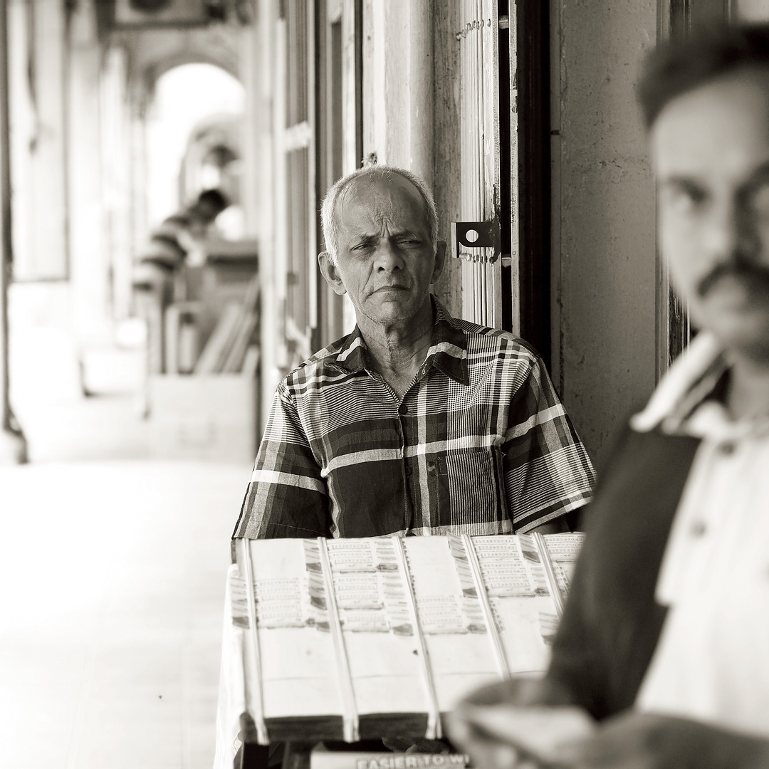
The Accidental Shot (man on the right entered the frame). Also, there was another man in the background, hence there were three men in this frame, and somehow the image did not appear cluttered at all. The focal point was still clearly on the man in the middle selling lottery tickets, and the foreground and background supported the main subject well.

The original clean shot. Now it seems too empty.
So what say you? Which image do you prefer? There is no right and wrong of course, and I would like to hear your opinion!


Hi Robin, I prefer the image with both people, but because its monochrome and you've cropped the left hand side more and it places the lottery seller in the centre of the frame. However its all personal preference. Cheers, Bryan
ReplyDeleteHey Bryan,
DeleteGood point. I cropped it in that way because the negative space at the left of the frame did not work with 3 subjects. However it looked fine in the second image.
I think the first photo works better in part due to the framing, which Bryan has mentioned and also the subject in the foreground seems to holding a ticket and therefore is interecting in the scene (correct me if I am wrong it is hard to tell what he is holding due to the depth of field, it could be a phone). I think greater depth of field would have added to the picture by decreasing some of the seperation from the subjects but seeing as you likely took the picture with another shot in mind its only on review that you see how another photograph could have emerged from the scene. Great article Robin.
ReplyDeleteHey Henry,
DeleteYeap that was completely unintentional to have the man in the frame, and I wanted to separate the lottery man from the background hence the heavy blur. Should I have anticipated the other man coming in I would have decided other wise.
It's spectacular to see how the stance of the lottery vendor remains the same on both shots! You would have staged this and it never would have worked so well. :-D This reduces the variables between the two images, making it a much easier (fairer?) comparison. I prefer the first shot as well, as much because of the man in the background as because of the intruder. The empty space in the back is worse than the empty foreground in the second shot, imho. Both images bear your signature, btw, making the best of the harsh light, as usual.
ReplyDeleteTake care and keep 'em coming!
Thanks Bert.
DeleteLight is mostly very harsh in Malaysia (and any tropical country). But of course, harsh light is not necessarily our enemy, we just need to use them in the way that helped the images.
The vendor was looking at me and usually when people know they were being photographed they stayed quite still for a while. Sometimes their expression changed, and for the case of the above, the images were taken just seconds apart. Hence the almost exactly the same pose.
I like the first one...sometime we can add another subject to d frame to create a strong storyline inside it..sometime d accidental subject can create a good story inside the pic.. and sometime the accidental subject can give a big impact to your pic.. for sure u know about it..
ReplyDeleteHey Hadi Nik,
DeleteI am fairly a simple person, and I normally do not think too much when I shoot. I stay with simplicity in my composition, and it is when things happen unexpectedly I get to see other possibilities!
Compositoonally, a lot came together for you unintentionally on your part, redulting in a really nice picture.
ReplyDeleteNamely,
Three planes of interest that created a foreground midground and background planes, thus creating illusion of depth.
The three planes were also of similar patterns, creating a sense of unity.
The three planes are then juxtaposed perfectly by the vertical design of the negative space.
Its a pity it was not intentional, if it were, you would have reached a new level in your photographic journey.
Its something to aim for, for each of us, the best street phoyographers can do this consistently, almost reflex-like.
My two cents.
Hi Robin,
ReplyDeleteI prefer the first shot than the second one. But the second shot is not too bad, especially when you crop it tight vertically.
Keep shooting and thank you for sharing them.
Bambang F. Suryadi
In doubt study the masters. In this case that would be Alex Webb. Oh, and yes, I too prefer the image with all three men. :)
ReplyDeleteThis comment has been removed by the author.
ReplyDeleteHi Robin, I indeed also prefer the first one. It has more sense of depth and action.
ReplyDeleteI find it very intresting what you say about using the 'layers' and why you (and I) don't use it.
I guess indeed that the 'one subject' way is just easier.. Looking for a second subject in front, behind or next to our main subject adds a total new degree of 'photographic seeing' we never knew existed.
I'm totally inspired by your post and the A/B comparison and will defenitly try what the layers can do in my own photography!
Greets from The Netherlands ;)